Problem
Kotahi is a tool built by Coko that manages the submission, review, and publication of preprints, micropubs, and journals. However, the reviewer status information in the manuscript peer-review workflow is scattered and uninformative. This, along with the dashboard structure, makes the management of manuscript reviewers inefficient and confusing. Additionally, the Digital Object Identifier (DOI) for publications is not flexible.
Solution
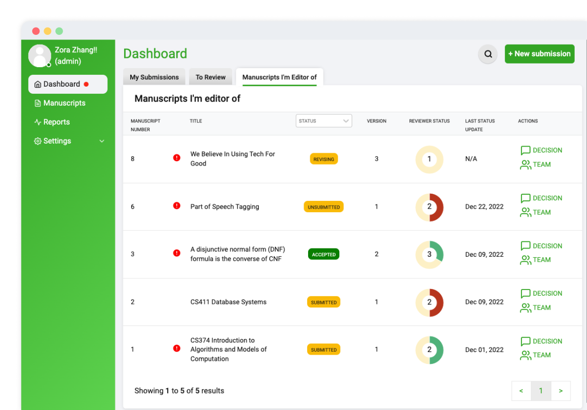
We worked with Coko on revamping the Kotahi dashboard to support a reviewer status kanban board, paginated manuscript tables, clear tab separations, and integrated action modals. This allows users of different roles to perform many actions easily and improves the efficiency of the review workflow. We also worked on connecting the DOI registration form to CrossRef to allow for a customized DOI suffix.
In addition, it was a large technical challenge to tackle continuity between mobile and desktop app display, as well as routing consistency between the apps. This impacted the way we thought about how to connect between the map and list views, as well as how to appropriately handle displaying location information on different modalities.
Design
Working on a large existing project like Kotahi had impactful implications in terms of the design challenges we faced working on our features. We stuck with the color scheme, typography, and general layout system already in use by Kotahi, and made our additions on the user experience side of the application more than anything. From the way users see their manuscripts in the dashboard to a simplified presentation of manuscript reviewers, we worked to simplify the review workflow.
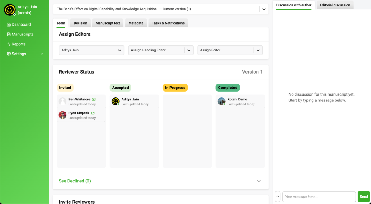
Understanding the research paper review and publication process was key to the design decisions as we hope to structure the UI/UX to be smooth and stream-lined. It was a big challenge to settle the format as to how the reviewer status should be displayed relative to a specific manuscript because there are many variables associated with this relationship. A kanban board suited this issue well, and its implementation is discussed in more detail in the features section.
Tech Stack
Kotahi is a full-stack project that is written entirely in JavaScript. For the frontend, we’re using modern technologies like React with Styled Components. We’re also using GraphQL with Apollo Client and Apollo Server to enhance the GraphQL experience and to serve as a flexible middleware to communicate with the backend. For the backend, we’re using Node.js and Express. The entire project is scaffolded with Docker Compose and end-to-end testing is automated with Cypress.
Features
Custom DOI Suffixes
Several current Kotahi clients have wanted to be able to customize their article DOI suffixes as part of their publishing workflow. We gave them the power to do this while ensuring their experience is consistent throughout the application. Users are able to submit a DOI suffix preference as an author or editor and are greeted with validation and confirmation of their choice in all parts of the process. For example, Kotahi now shows DOIs that will be registered upon publishing a research object. Our changes work directly with Kotahi's existing Crossref API integration, which registers DOIs on their behalf.
Reviewers Kanban Board
Journal editors using Kotahi previously had trouble managing the reviewers they assigned to manuscripts. We streamlined the manuscript review process by reorganizing and simplifying the reviewer listing. By swapping the card list into a fully-featured kanban board, editors are able to quickly differentiate reviewers based on their review status and drill down into review information via detailed modals. Things like email and dashboard invitations are easily distinguished in this new system. Less useful reviewer categories are separated from the larger board to give editors an effective birds-eye view.
Review Details Modals
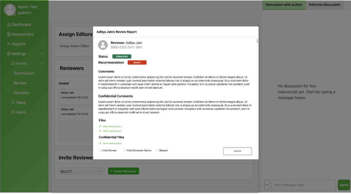
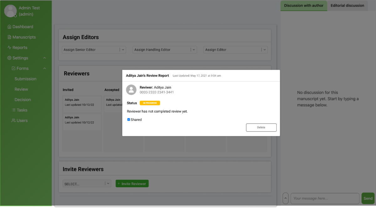
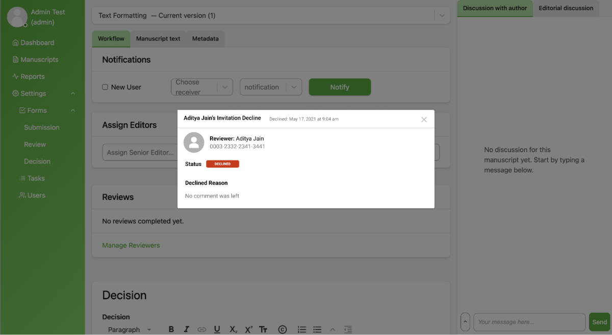
As mentioned, detailed modals complement the new reviewer kanban board by separating the individual review from the review process itself. In progress and completed reviews have dedicated modals with all content, attached files, and authorized confidential information present. In a separate section below the board, declined reviews are listed with a popup available to see a user's decline reason, if it exists. Additionally, new popups have been added to invite and delete reviewers, with an extended list of features such as email notifications for existing accounts.
Dashboard Restructure
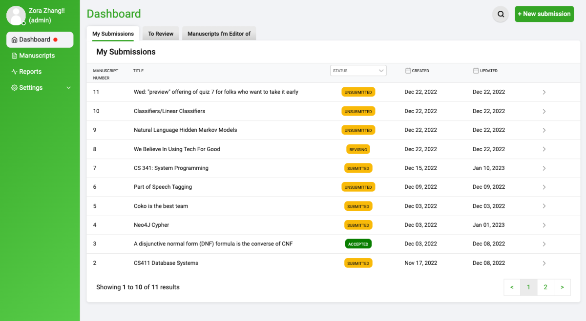
The dashboard, which is something of a "homepage" for Kotahi's users, was previously unequipped at giving users a place to start their daily work. We restructured the dashboard by separating individual role's sections into distinct tabs to keep the user's focus on their current goal. On each tab, we transformed the several card lists into interactive tables with full support for searching, sorting, and filtering. We tested the new dashboard's design with users to understand the best selection and format for the data.


