Problem
ClearpathNYC connects homeless youth with various resources and nonprofits across the New York City area through an online map portal. Despite its initial goal, the user experience had been hindered by many challenges. The dashboard was cluttered and users were unable to filter by need or location. Moreover, its lack of mobile-friendliness added to the usability issues. Additionally, nonprofits were unable to personally display information and access applicants within the portal.
Solution
We worked closely with ClearpathNYC to create a more user-friendly resources map dashboard tailored to the needs of homeless youth. Our main goal was to build an intuitive map interface, ensuring easy navigation while showing the most important resource details in a clear and concise manner. During development, we placed strong emphasis on optimizing the mobile experience since many of our users access the portal using their phones.
We also addressed the nonprofit pain points by developing a nonprofit dashboard with a streamlined onboarding process and the ability to process applicants interested in their resources. These new features allow ClearpathNYC to more effectively connect users with the resources around them, fostering a stronger support network for the houseless youth.
Design
In our design process, we delved into two key aspects: 1) the need to streamline information within the map view and facilitate personalized searches; and 2), the aim to enable nonprofits to track interest and manage applicants through the portal.
Our primary objective revolved around simplifying the visual overload on the screen. To achieve this, we experimented with various techniques like icon integration, color-coding, and screen segmentation in order to make the information easier to digest for users. For a more personalized search experience, we categorized resources and introduced filters based on factors such as age groups and demographics. These filters were ingeniously visualized on the map through category icons, adding a layer of clarity to the display.
Moreover, another big technical challenge was continuity between the mobile and desktop app display. We had to think about displaying the map content on a smaller dimension screen without it getting cluttered. This impacted the way we thought about positioning elements and what things we could add or get rid of in the mobile views.
Tech Stack
ClearPathNYC’s portal is a progressive web application that’s built on the FERN template: Firebase, Expressive, React, and Node. We retained the existing architecture of the portal’s predecessor that utilizes TypeScript across the frontend and backend. Our platform is both web and mobile responsive to cater to all types of users, especially those using shared devices from public libraries or friends. All of the resource descriptions are stored on Firebase, enabling nonprofits to update their information and manage user applications in real time.
Features
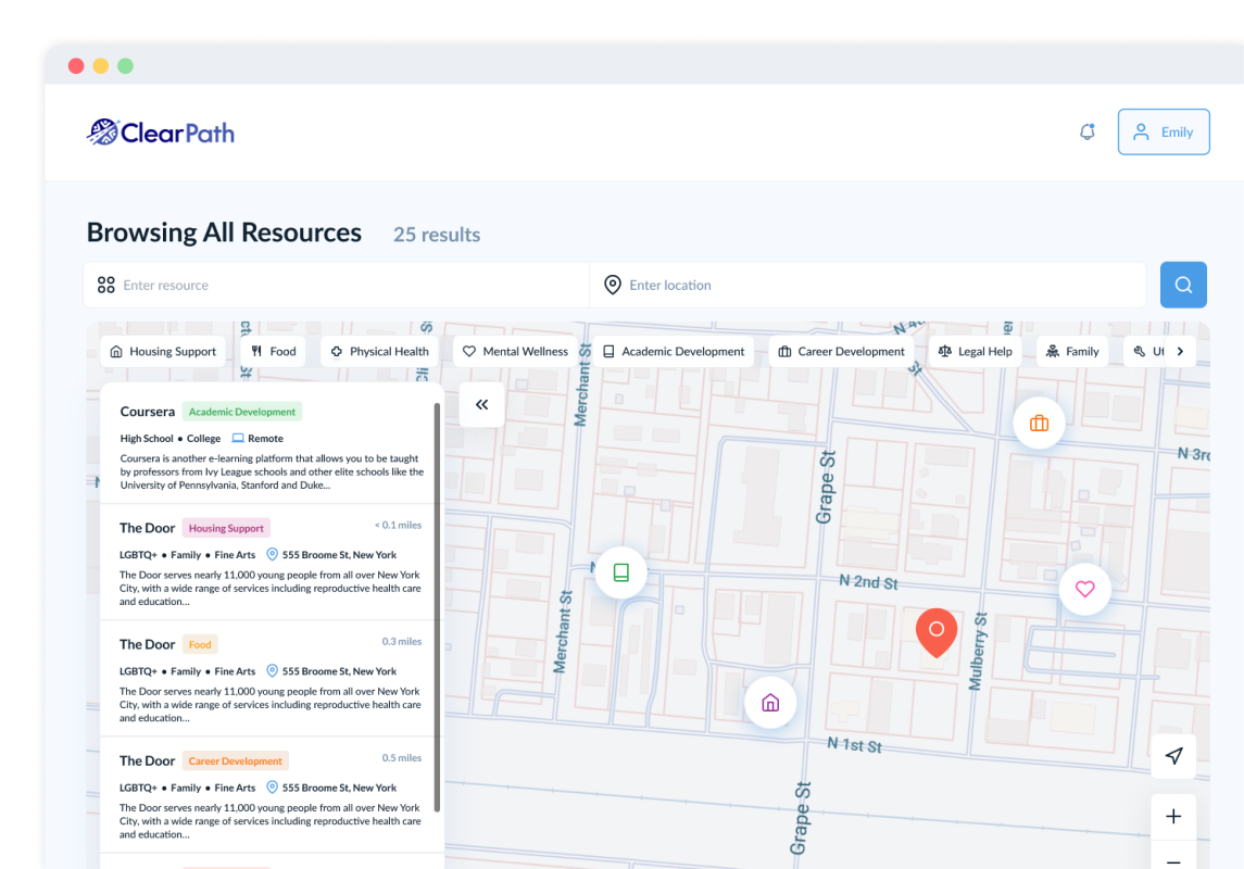
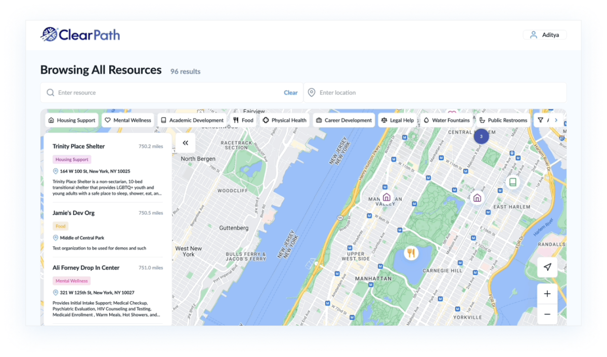
Resources Map
In addressing the challenges faced by ClearpathNYC's online map portal, our team knew we needed to make the site less-cluttered and easier to use overall. One key feature that significantly contributed to achieving this goal is our revamped resources map. We clustered resources based on proximity and zoom levels, ensuring that users can easily navigate and locate the support they need. Further, we implemented a thoughtful categorization system, allowing users to filter resources based on specific needs, providing a more focused and personalized browsing experience. We also replaced text with intuitive color-coded icons, streamlining the browsing experience and making it more visually accessible.
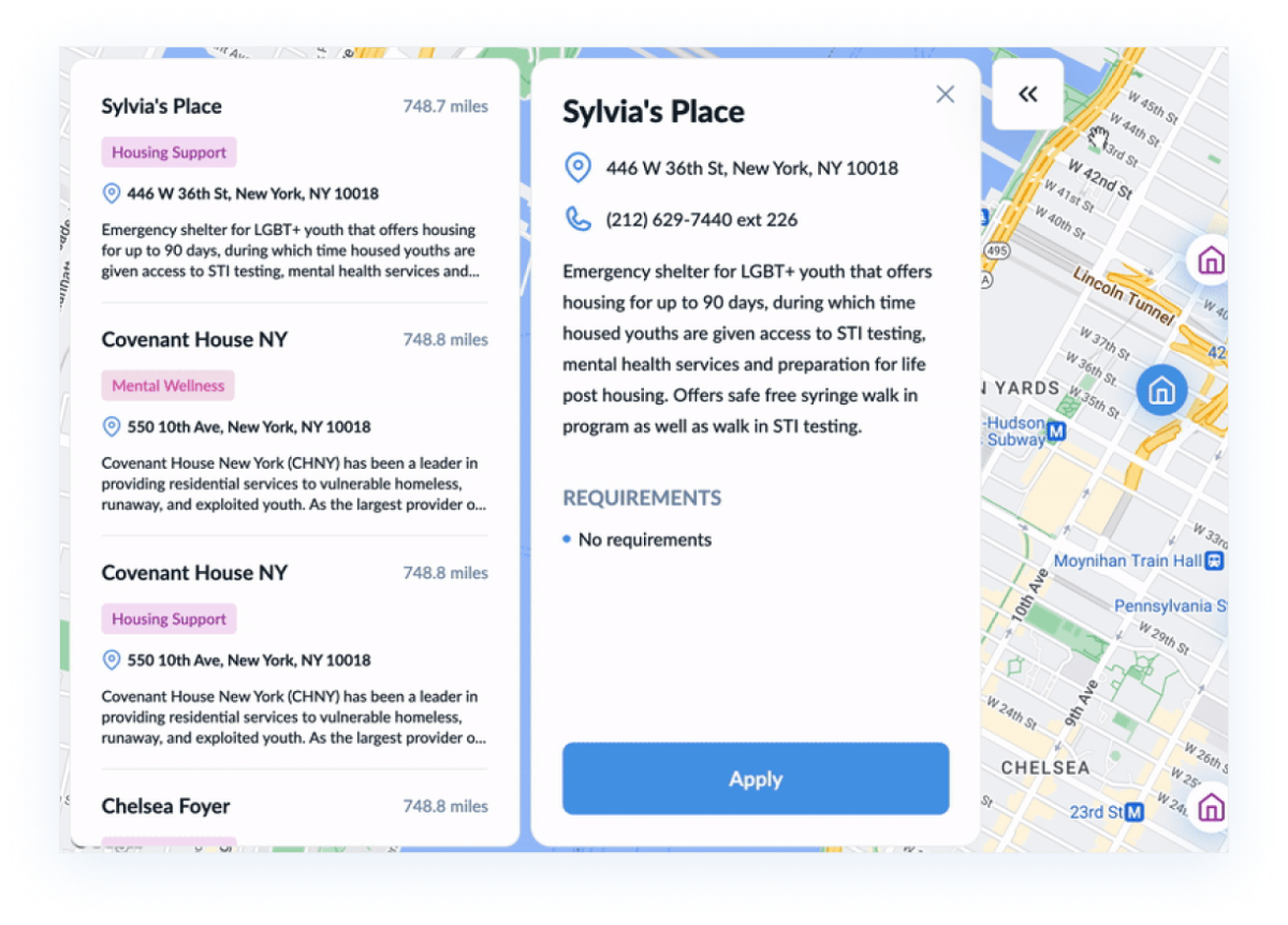
Resources Sidebar and Popup
The resources sidebar builds upon the existing ClearPathNYC platform, incorporating important organizational details into the user-facing application. It also facilitates the application process by making it possible directly from the dashboard. By incorporating clickable links, we've streamlined the navigation, making it more intuitive for users to explore and connect with the resources they need. To further optimize user engagement, the result card design prioritizes key organization features, allowing users to quickly skim through essential information. Additionally, our detailed resource popup employs iconography to succinctly summarize vital details, ensuring a clear and concise presentation.
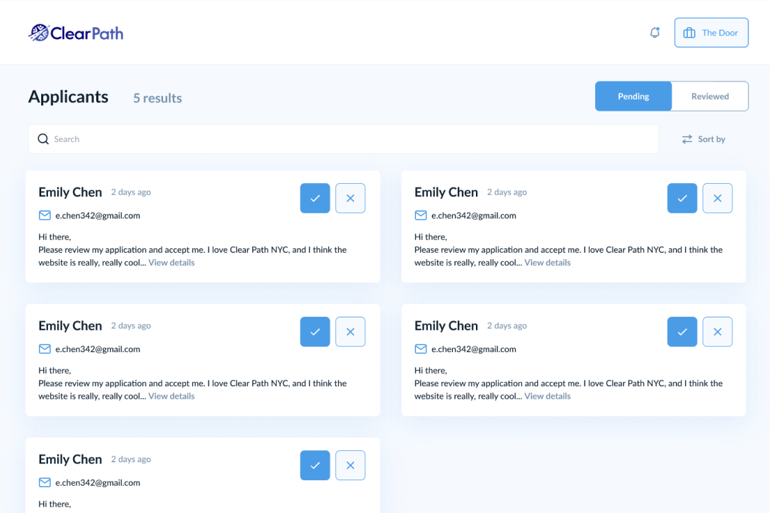
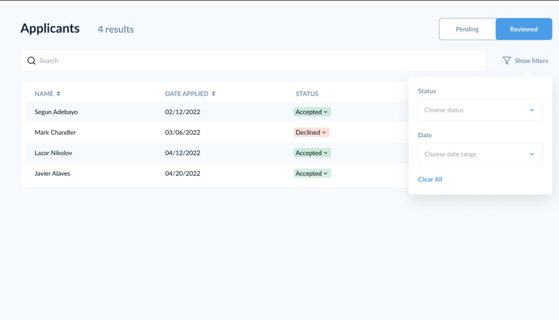
Nonprofit Dashboard
In addition to the improved experience for ClearPathNYC end users who are looking for organizations and resources, we also wanted to help ensure those looking to help are able to do so. To this end, we expanded the nonprofit dashboard in a few key ways. The first change was enhancing the personal feel of the platform by adding more complete applicant processing and communication systems. Organizations can use more advanced sorting and filtering mechanisms to look for applicants with specific attributes.
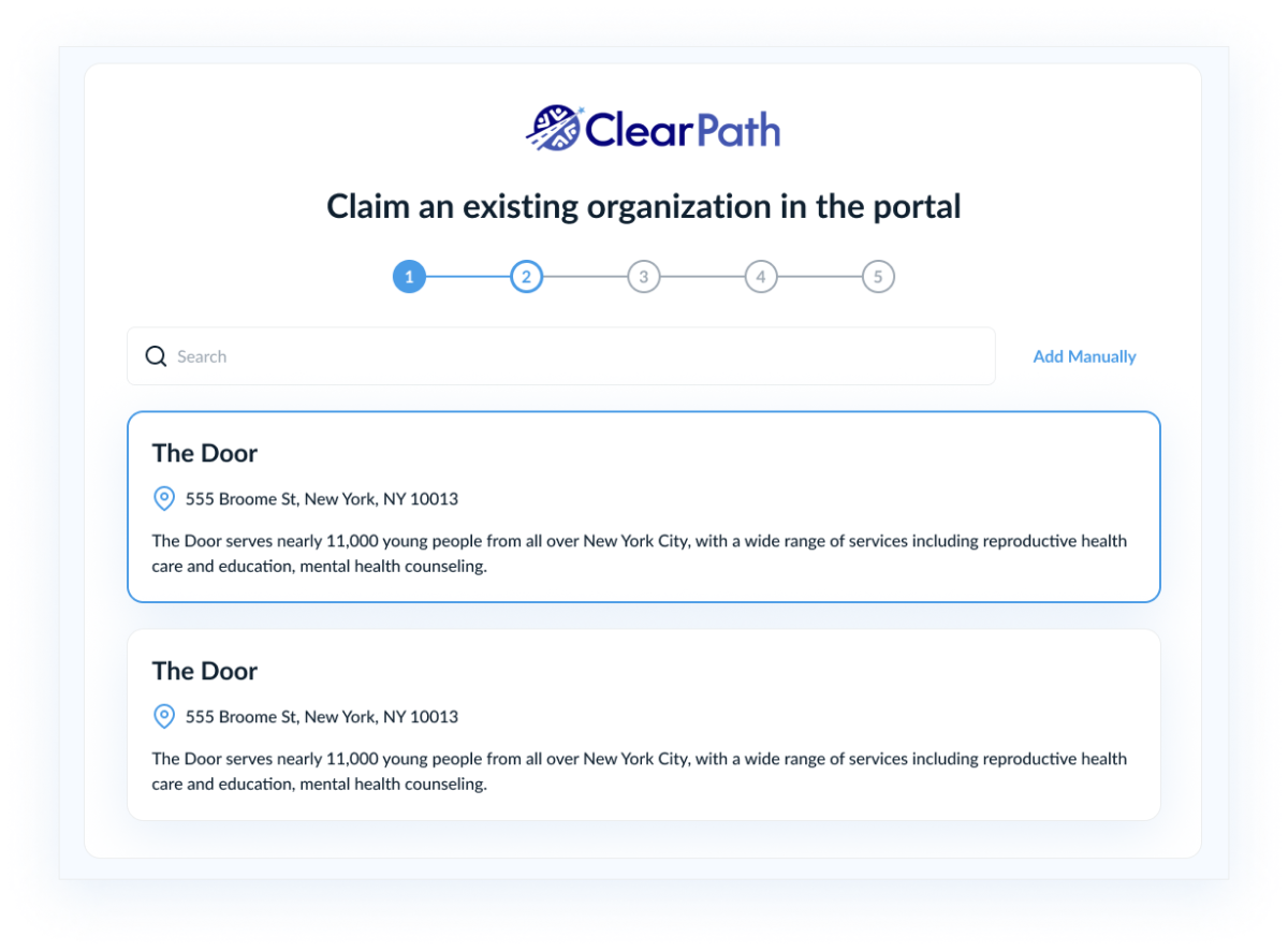
Nonprofit Registration
Facilitating nonprofit registration and verification, this feature offers a straightforward yet comprehensive process for those looking to join the ClearPath platform to do so. Nonprofits can easily claim pre-existing organizations on the portal and conveniently update their information through the ClearPath portal.